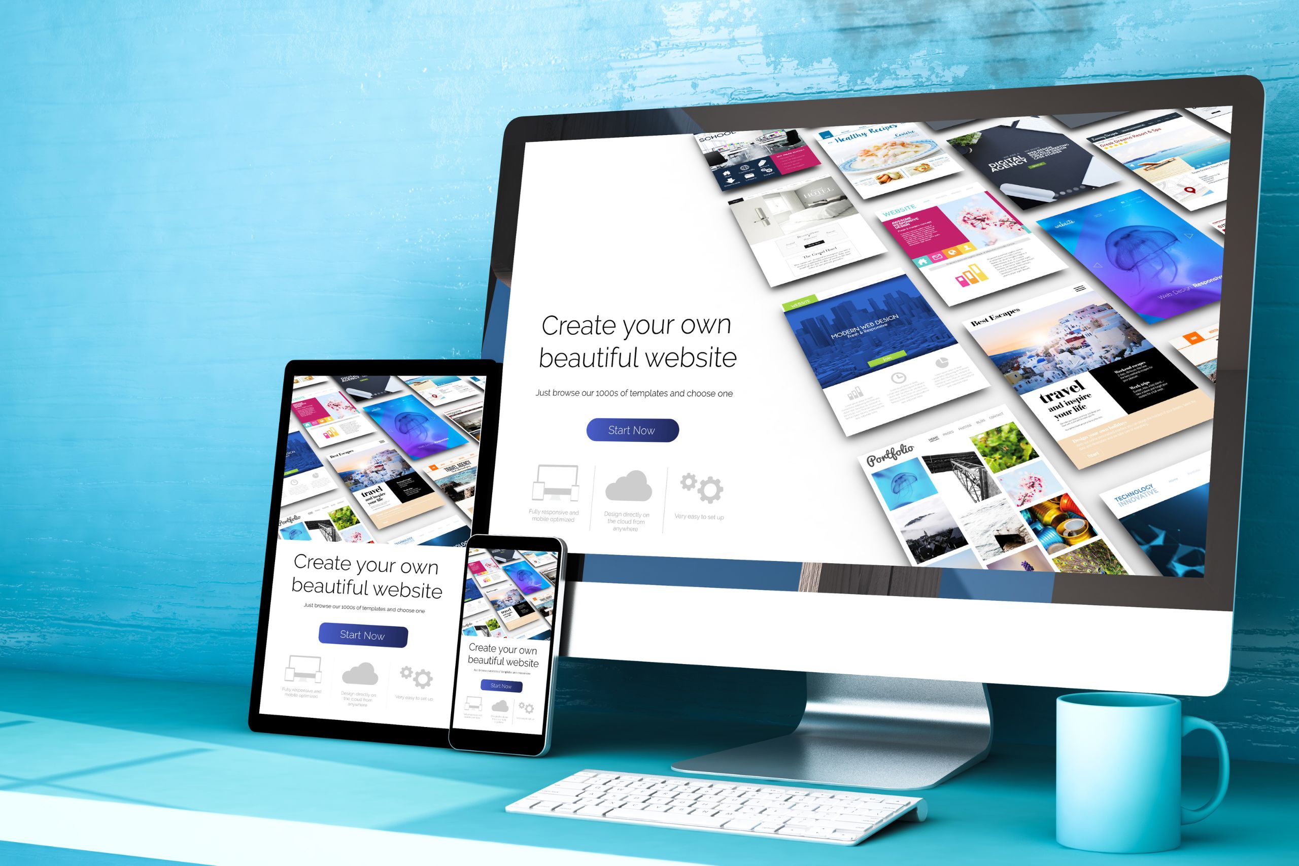
UX and UI elements in Gutenberg, the new WordPress editor: how to use them properly
Approved in late 2018, Gutenberg is the new standard WordPress editor that brings significant changes to the way content is created and edited. Using a block structure, Gutenberg allows more flexibility in the layout of posts, while offering a convenient and intuitive user interface. In this post, we'll take a look at some of Gutenberg's key UX and UI elements and learn how to use them properly.
1. The Gutenberg interface
Gutenberg's interface is simple and minimalistic, aiming to focus on content rather than setting options. The editor consists of two main parts – the blocks panel and the writing area. The blocks panel contains all the available blocks that you can use, while the writing area is where the post itself is formed.
2. Working with blocks
Blocks are the basic unit for creating content in Gutenberg. Each element of your post—paragraph, title, image, quote, list, etc.—is a separate block. This allows each piece of content to be edited and changed independently of the others.
3. Personalization of the blocks
Gutenberg offers a rich set of settings for customizing blocks. Each piece of content can be formatted and styled to suit your needs and preferences. You can change the font size, colors, background, alignment, spacing and many other parameters.
4. Embedding multimedia content
With Gutenberg, embedding multimedia content becomes easy and convenient. You can add images, video, audio, graphics, tables, and more. with a few clicks. This creates a richer and more visually appealing user experience.
5. Preview and Publication
Gutenberg offers a preview feature that lets you see how your post will look before it's published. This way you can make sure everything is in order before you share your content with the world.
In conclusion, Gutenberg offers powerful tools for creating quality and attractive content. With a little practice and patience, you can impress your visitors with professionally designed posts.


