Mobile Responsive Design: Why It Matters and How to Achieve It with WordPress
In today's fast-paced digital society, more and more people are using mobile devices to access the Internet. According to statistics, over 50% of web traffic comes from mobile devices, making responsive design extremely important to the success of any website or online store. In this article, we'll look at the importance of mobile responsive design and how to achieve it using WordPress.
Why is mobile responsive design important?
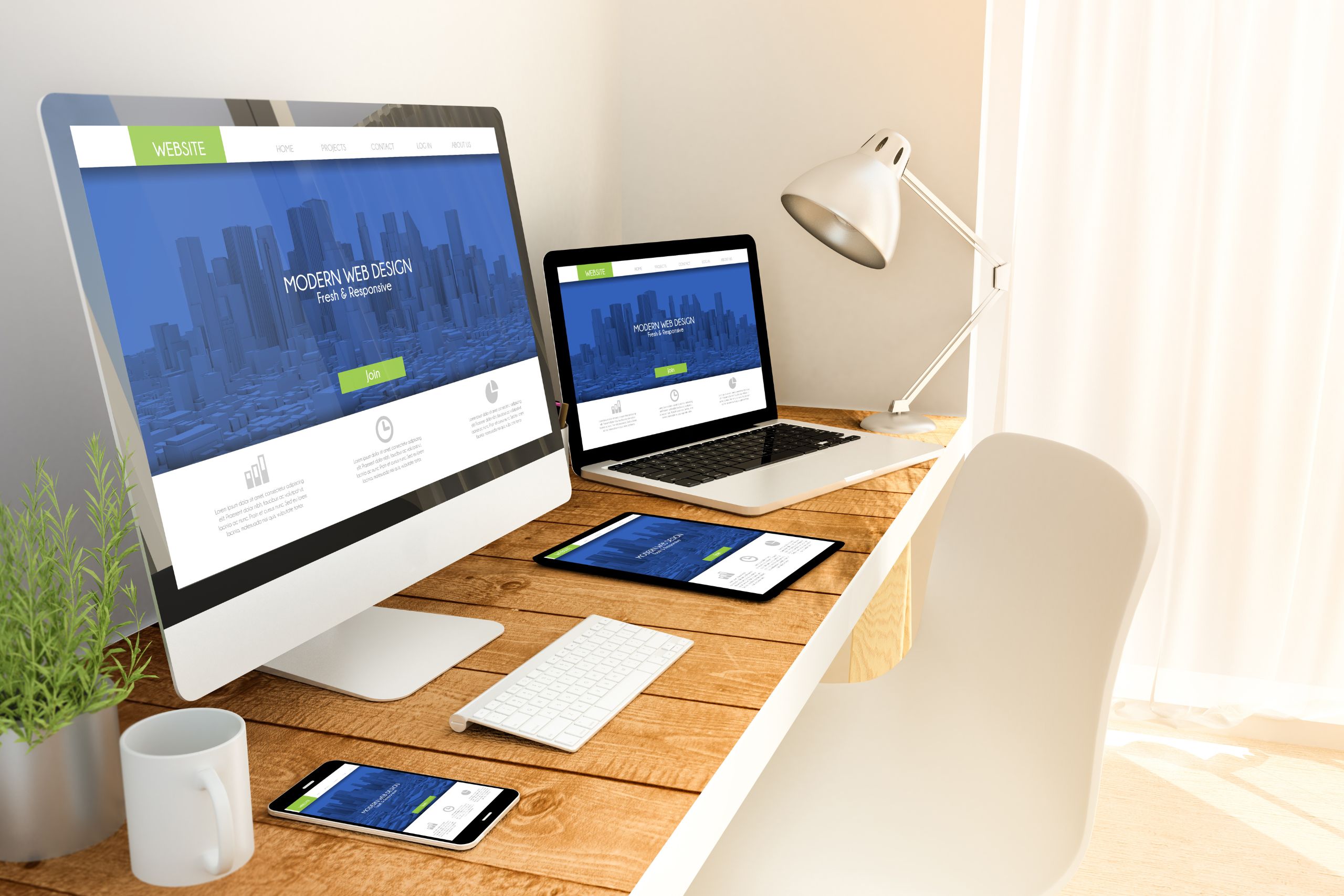
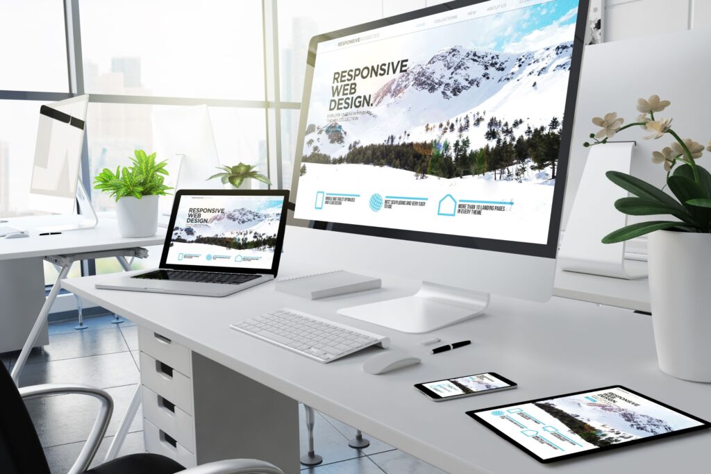
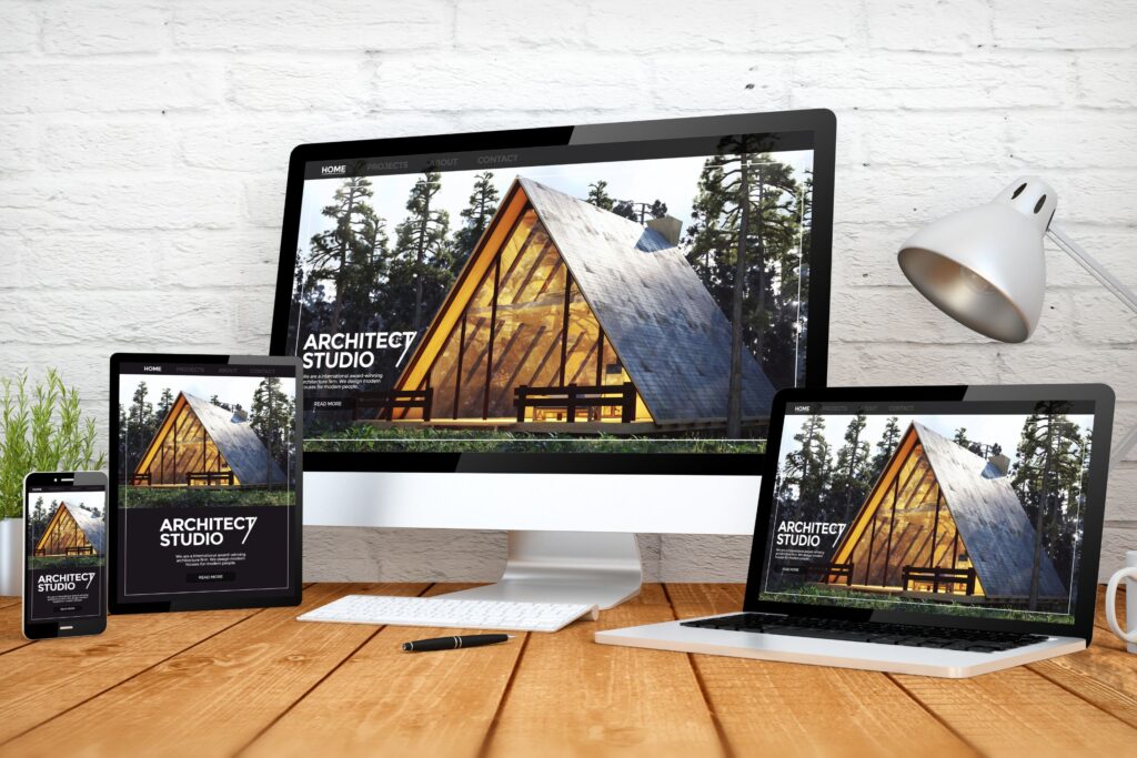
Responsive design is a method of preparing websites and online stores so that they automatically adapt to the different screen sizes and orientations of mobile devices. This is essential for the following reasons:
- Improved user experience: Responsive design ensures that users can use the website or online store without problems, regardless of the screen size of their device.
- SEO benefits: Google prefers websites with responsive design and ranks them higher in search results because they offer a better user experience.
- Fast charging: Responsive design enables faster page loading as it optimizes images and other elements for mobile devices.
How to achieve responsive design with WordPress?
Follow these steps to create a mobile responsive design using WordPress:
- Choose a responsive WordPress theme: When choosing a theme for your website or online store, make sure it's mobile-friendly. In most cases, modern WordPress themes are already responsive by default, but check if this is the case before choosing it.
- Test your website on different devices: Use tools like Google Mobile-Friendly Test or BrowserStack, to test your website design on different mobile devices and screen extensions. This will help you identify and fix issues that occur at different screen sizes.
- Use plugins to enhance responsive design: Some WordPress plugins can help you improve the responsive design of your website. Such plugins include WPtouch, Jetpack and AMP for WP, which automatically optimize your pages for mobile devices and provide a better user experience.
- Optimize images and video: To make sure your media files load quickly and look good on mobile devices, use optimized formats like WebP for images and HTML5 video instead of Flash. Also, use plugins like Smush or EWWW Image Optimizer, which automatically compress and optimize the images on your website.
- Use flexible design elements: When creating a responsive design, use flexible units such as percent, em, and rem to set element sizes instead of pixels. This will ensure that your design will automatically adapt to different screen sizes. Also, apply flex grids and flexboxes to arrange page elements.
- Keep your theme code and plugins up to date: Regularly update your WordPress theme and plugins to ensure they are compatible with the latest versions of WordPress and with mobile devices. Updating the code will help maintain responsive design and prevent potential problems.

Responsive mobile design is critical to the success of your website or online store. With WordPress, you have the ability to achieve a responsive design by choosing a responsive theme, testing the website on different devices, using plugins to enhance responsive design, optimizing images and video, and using flexible design elements. Keep your theme and plugin code up to date to ensure mobile compatibility and to give your users the best experience possible.